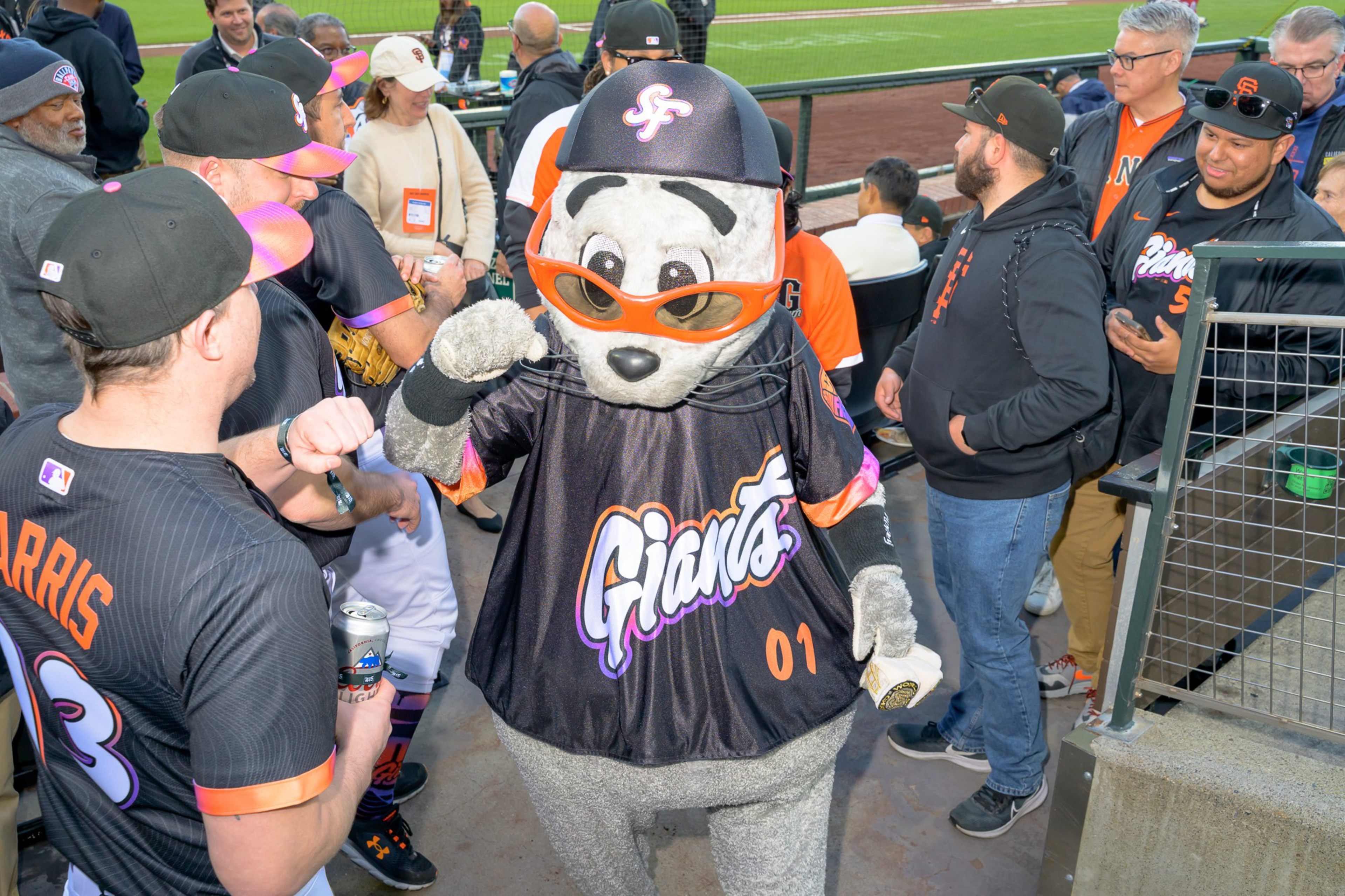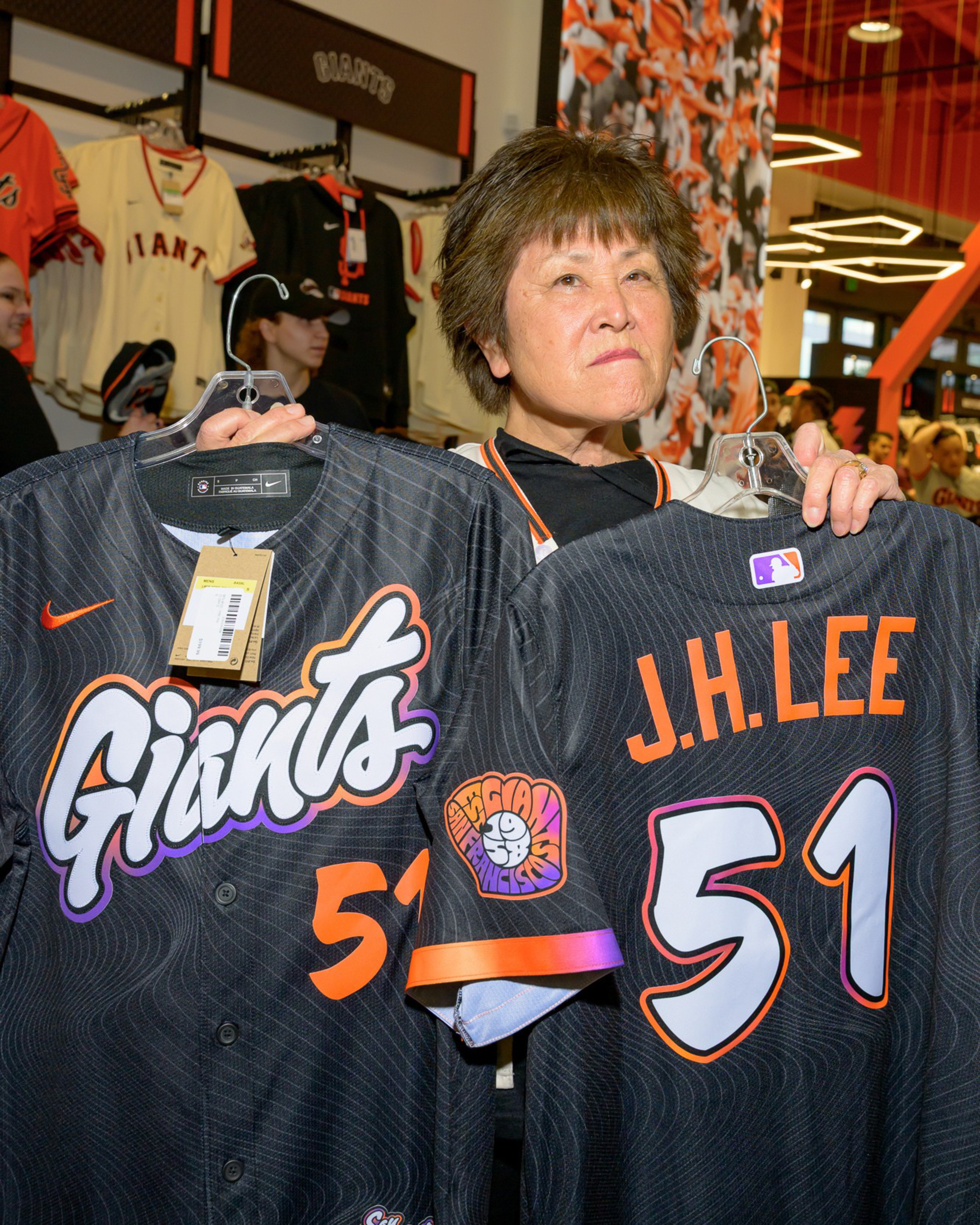
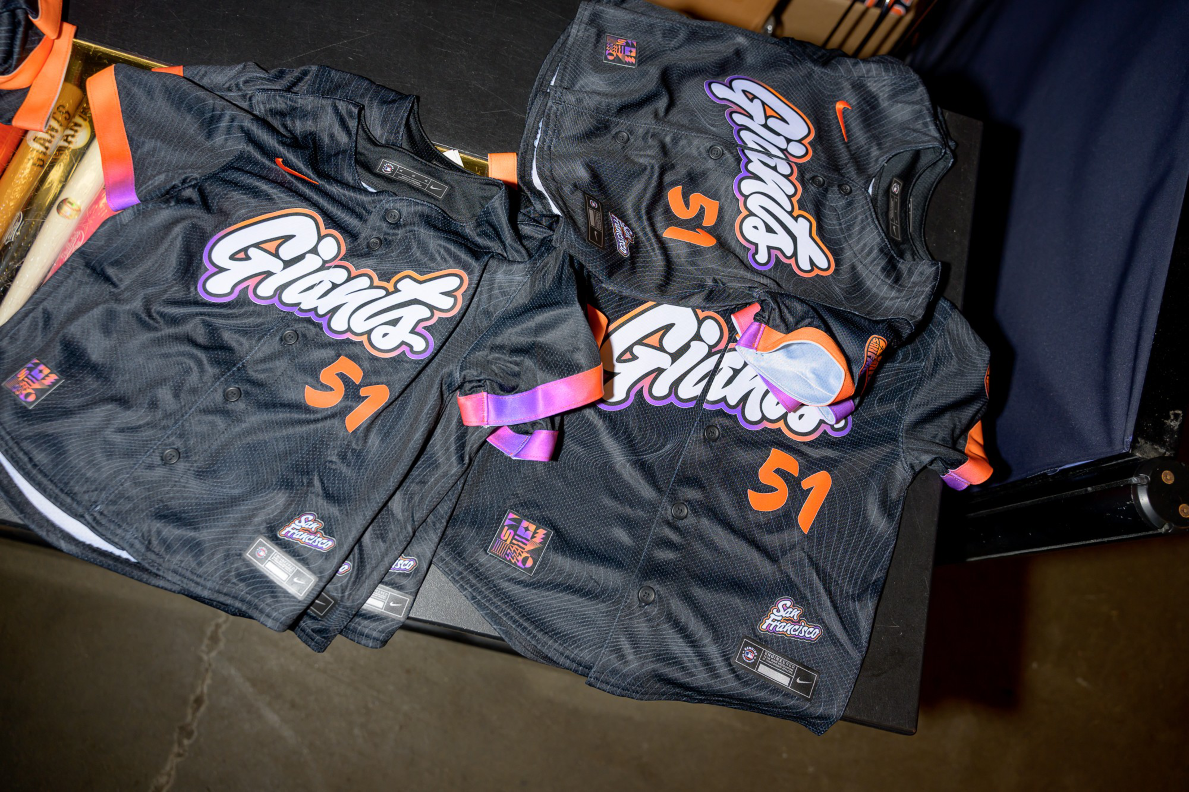
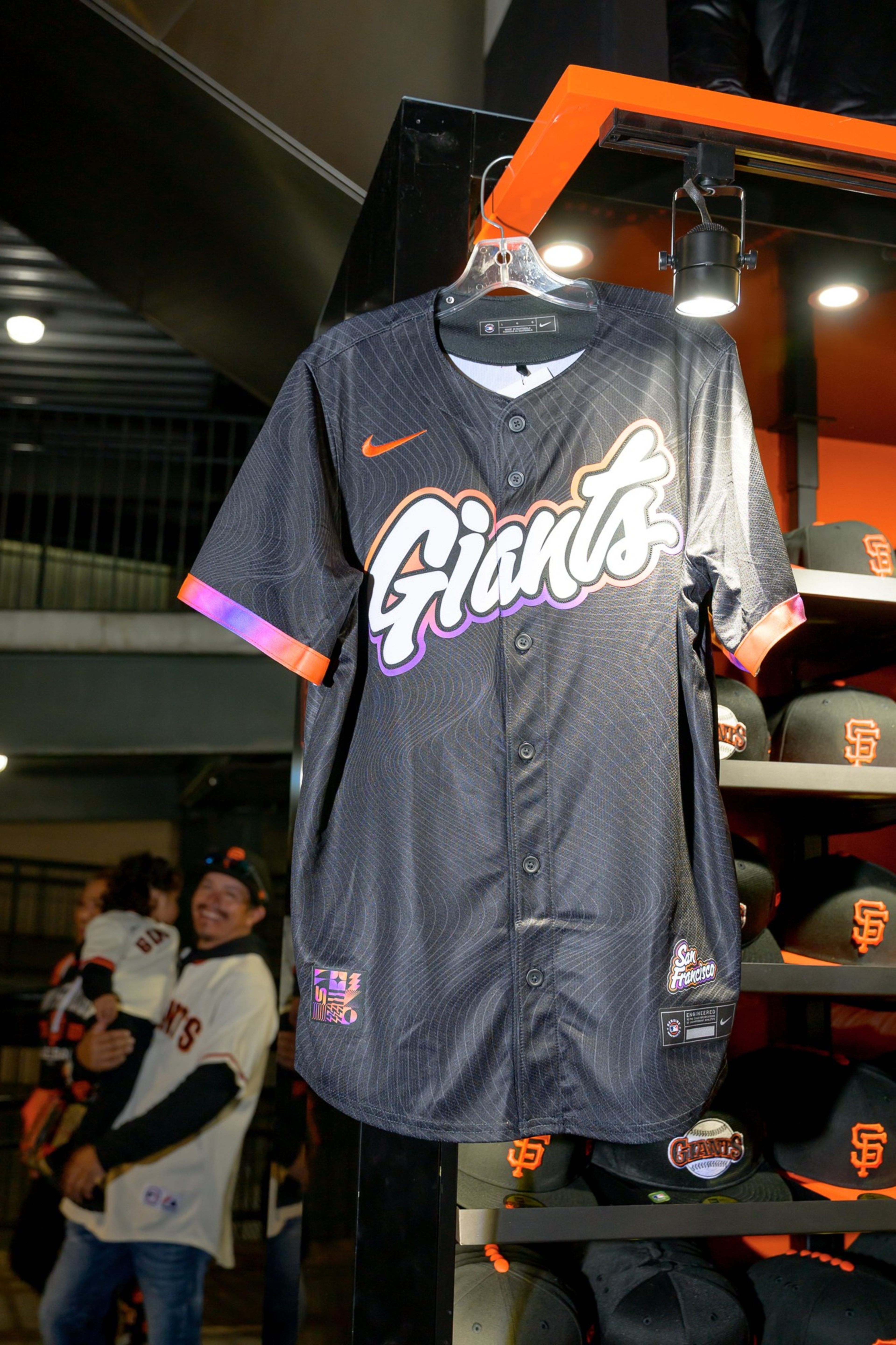
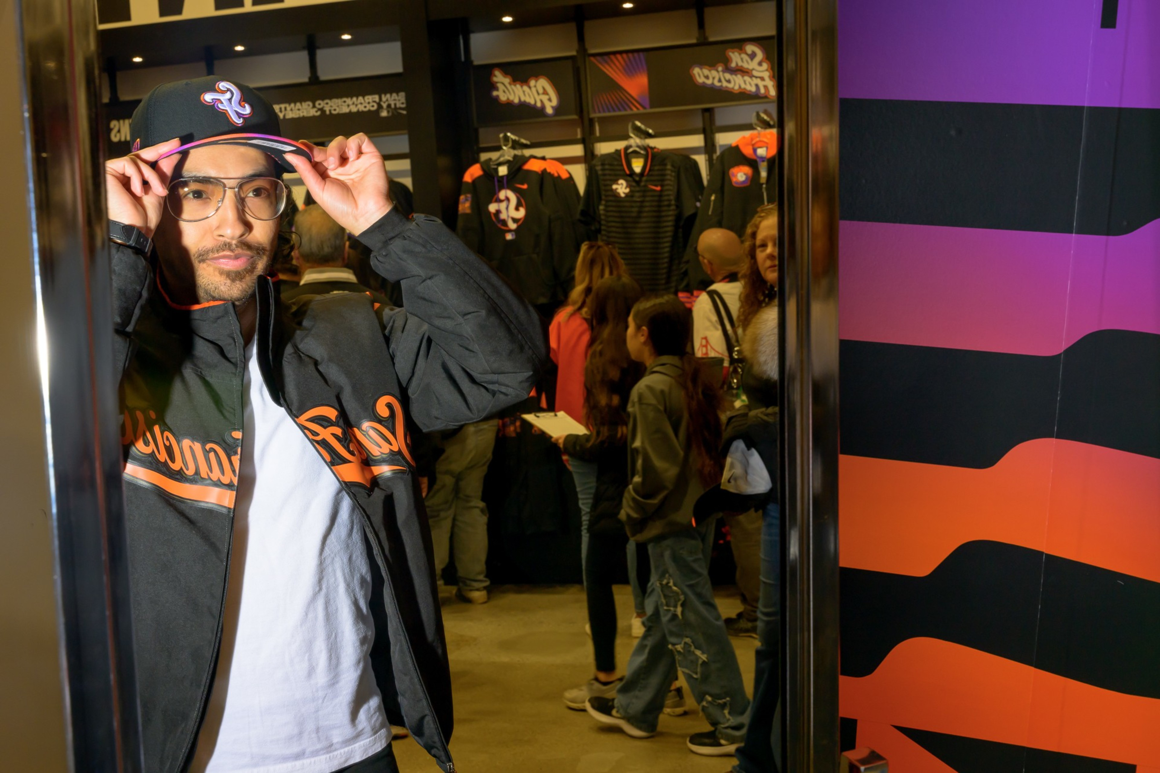
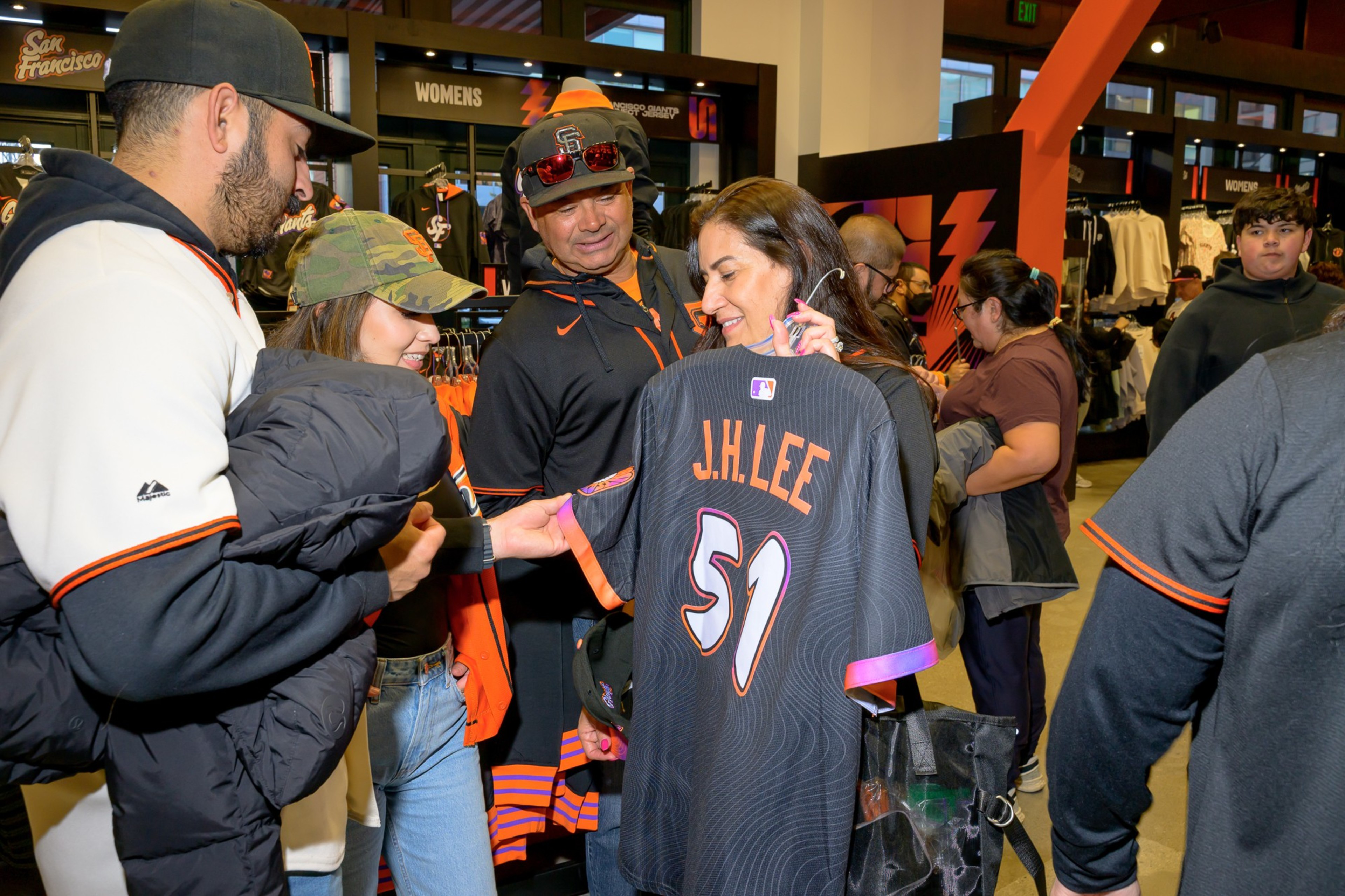
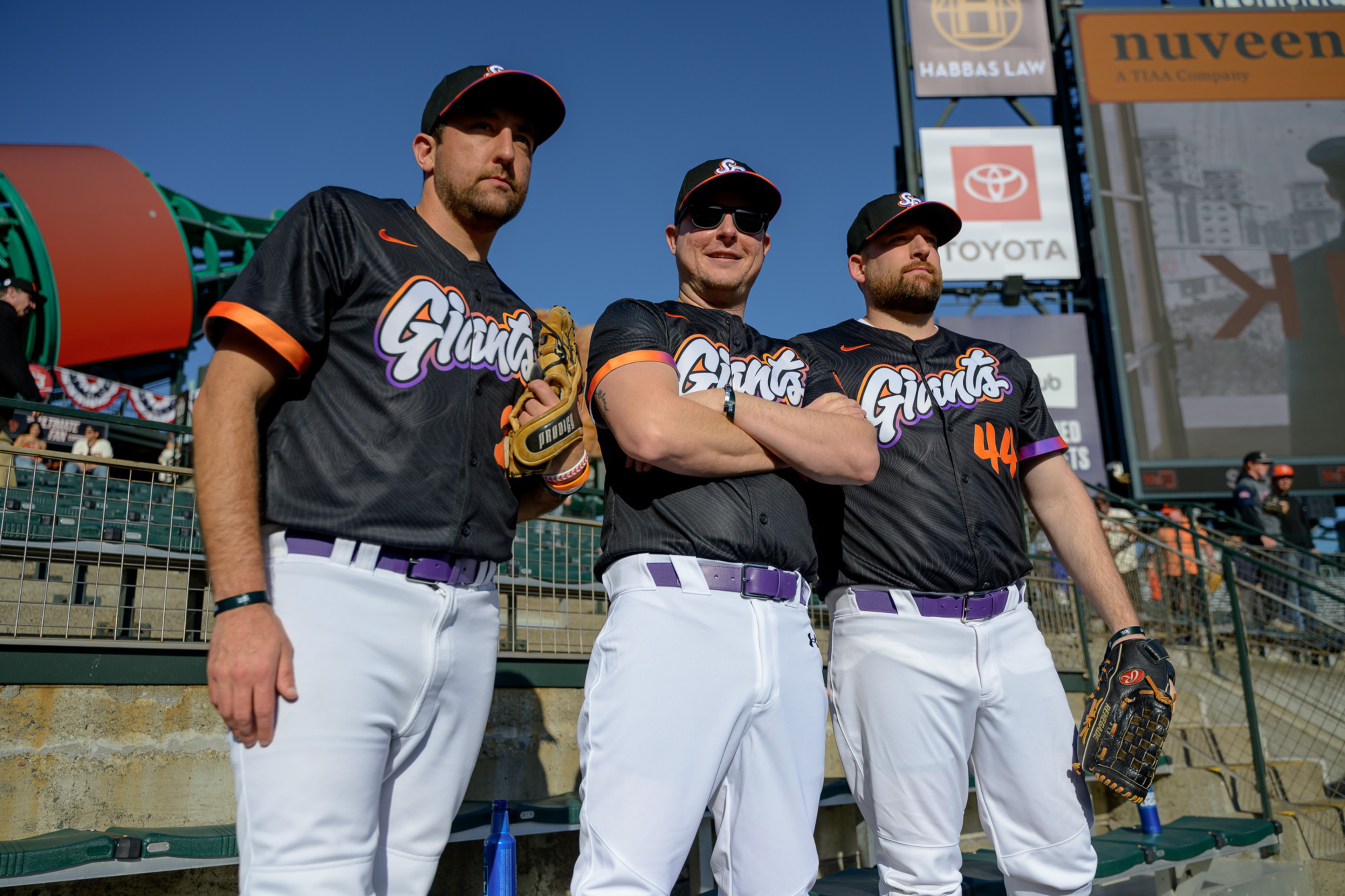
The Giants unveiled their City Connect jerseys Tuesday night at Oracle Park in their matchup against the Cincinnati Reds, and to say that the new look is a remix would be an understatement.
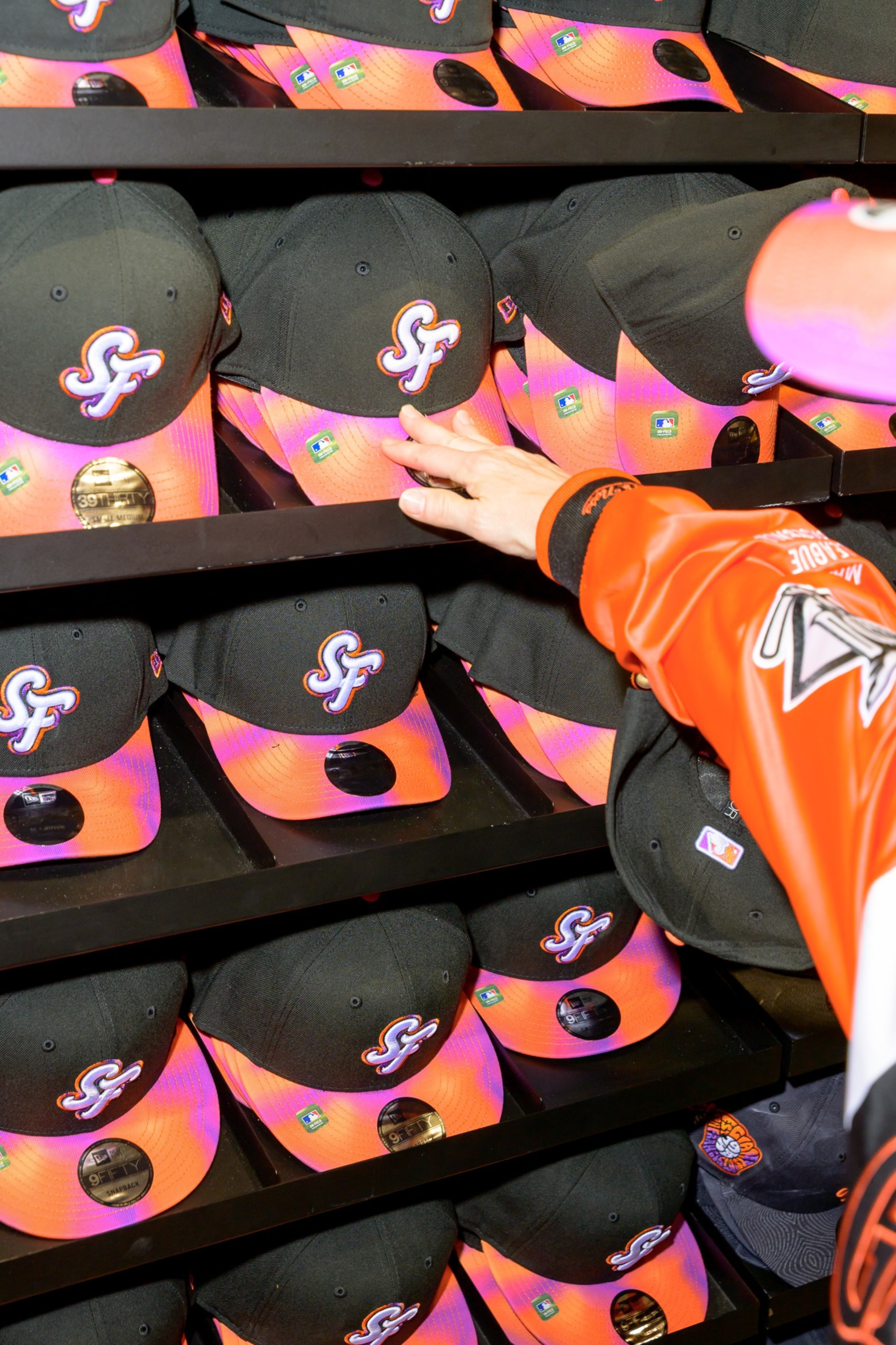
The Giants say the design is a nod to San Francisco’s music scene: a black top featuring subtle white sound waves — inspired by the grooves of a vinyl record — and orange-and-purple gradients giving a tie-dye feel.
Why purple to join the iconic orange and black? Apparently, the New York Giants wore purple in 1913-17 as a tribute to the color of New York University.
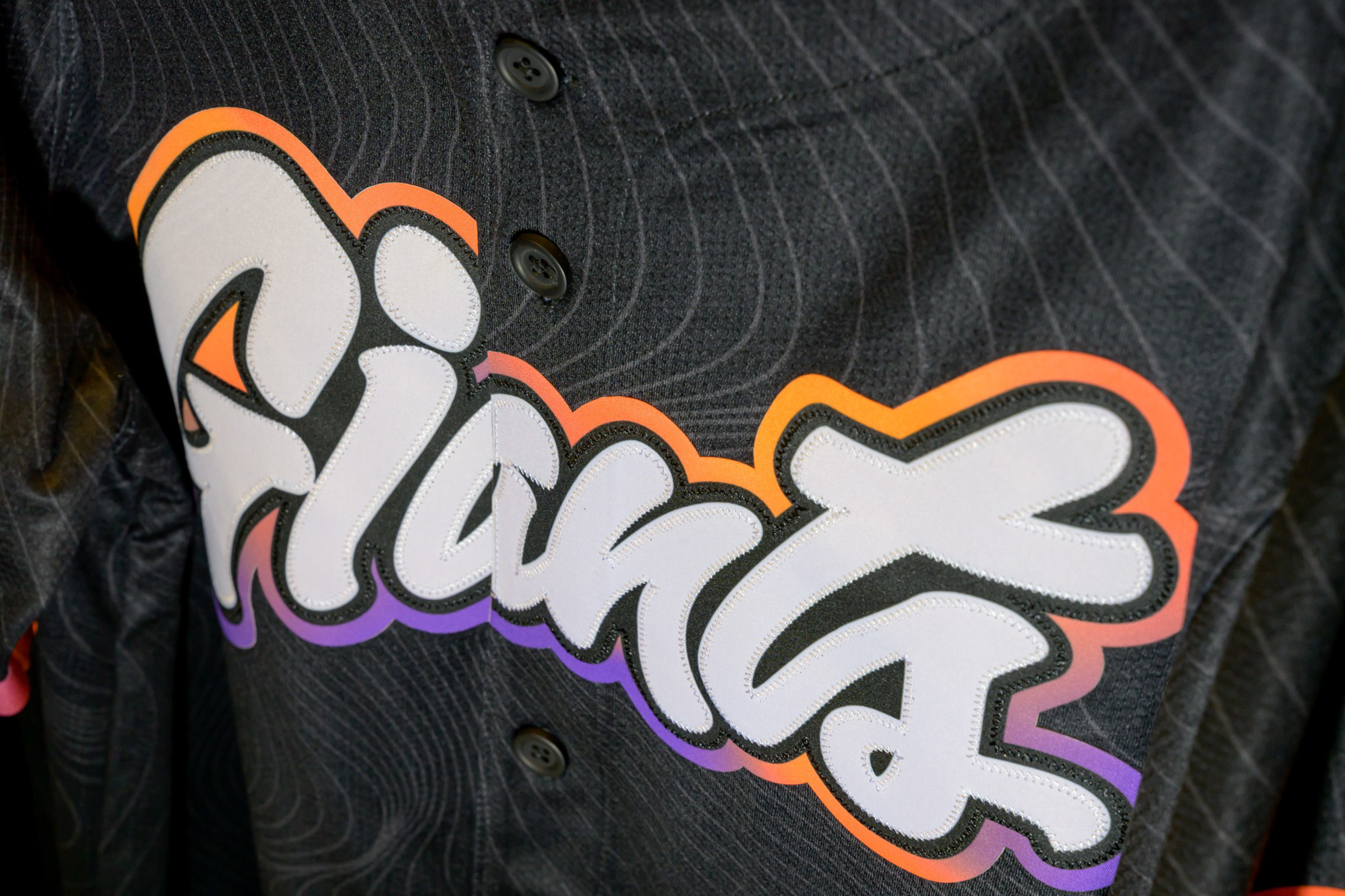
While skepticism that Major League Baseball’s annual City Connect uniforms are just an excuse to sell more jerseys is valid, nobody can say the Giants didn’t put thought and care into the design and the accompanying story. Even the sleeve emblem honoring the team’s move to San Francisco in 1958 looks like one of those groovy 1960s gig posters, and the “Giants” in script across the front is meant to evoke a lava lamp in motion.
Was The Standard’s staff moved by the effect? We asked for their verdict.
Yikes, but I’ll buy one anyway
Call me old-fashioned, but purple has no place on a San Francisco Giants jersey. The purple-to-orange gradient is giving Phoenix. It looks like it escaped from a Crazy Shirts outlet in 1992. That said, I’m a lifelong fan, and I buy all the jerseys, no matter how offensive. So this look will soon be shoved in the back of my closet next to the infamous, Tang-inspired (opens in new tab) City Connect design from 2021, which thankfully died a quick death. — Annie Gaus, Politics Editor
‘I don’t get why’
As a baseball-agnostic alum of New York University, I don’t get why these uniforms would pay homage to my alma mater, but I’m always down with pro athletes wearing a little purple. I like the low-key psychedelic bubble font, too, although the gray lines feel like a random contour map. The best design element is the three-by-three grid of orange-and-purple tiles. Literally no idea what that’s for, either, but it looks sick. — Astrid Kane, Senior Editor
It’s giving ‘startup merch’
[DISCLAIMER: I do not know what I’m talking about.] People born and raised here are always lamenting the disappearance of longstanding institutions and the hijacking of the city’s image by tech companies. Those people will not be pleased to discover that the Giants — one of the city’s oldest institutions and a strong contributor to its aesthetic — seem to have copied their new colorway from the Instagram logo. — Max Harrison-Caldwell, Express Desk Reporter
Here for the vibes
I’ve always loved a sunset ombre. Paired with the “sound wave” design that looks more to me like psychedelic tiger stripes, the look strikes me as a little Lisa Frank, in the best way. — Jillian D’Onfro, Business Reporter
Against it for philosophical reasons
These jerseys are obviously atrocious on their merits (viz the garish color scheme, the screensaver-eque waves motif, the cheap-polyester shine, the goofy puff-paint font), but they’re also atrocious on principle. Everyone knows baseball teams should have two jerseys: home and away. Once a season, they’re allowed to wear a throwback. That’s it. Also, players should wear stirrups, and the designated hitter is an offense against God. Now get off my lawn. — Jeff Bercovici, Managing Editor