How has San Francisco reduced its greenhouse gas emissions? How long does it take for an ambulance to arrive? How many car break-ins were reported last month?
San Franciscans can get the answers to these questions and many, many more on the Office of the City Controller’s Performance Scorecards, relaunched and fully updated for the first time since early 2020.
The data dashboards track a series of metrics about the quality of the city’s services in nine areas: public health, livability, safety net, public safety, homelessness, transportation, environment, economy and finance.
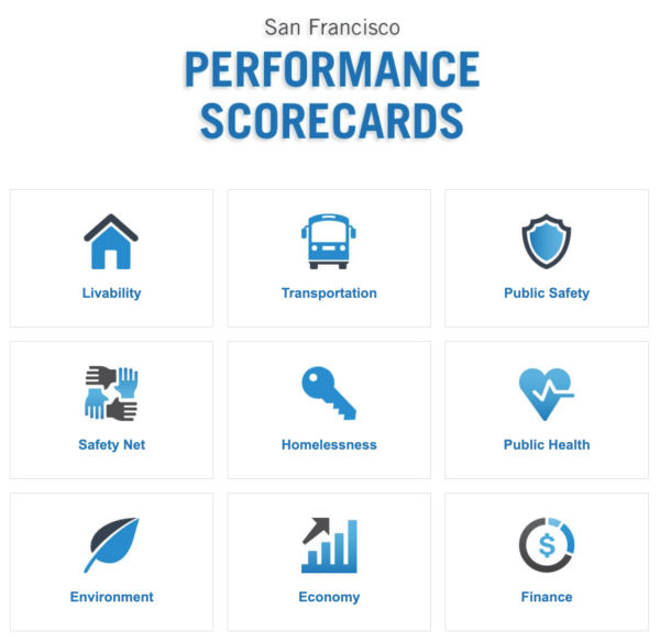
The Controller’s Office first launched the Performance Scorecards in March 2016. Updating for many of the scorecards was paused during the pandemic but over the past few months, new datapoints were added gradually. Today’s relaunch is part of a long-term citywide strategy to provide easy access to public data sources.
Residents can dive into the datasets in each scorecard to find out more about the areas of SF life that they care about most.
Each scorecard is color coded for quick review: green signifies the city’s target performance is being met, yellow indicates it needs improvement and red shows underperformance. Some of the performance metrics can be tracked back nearly two decades.
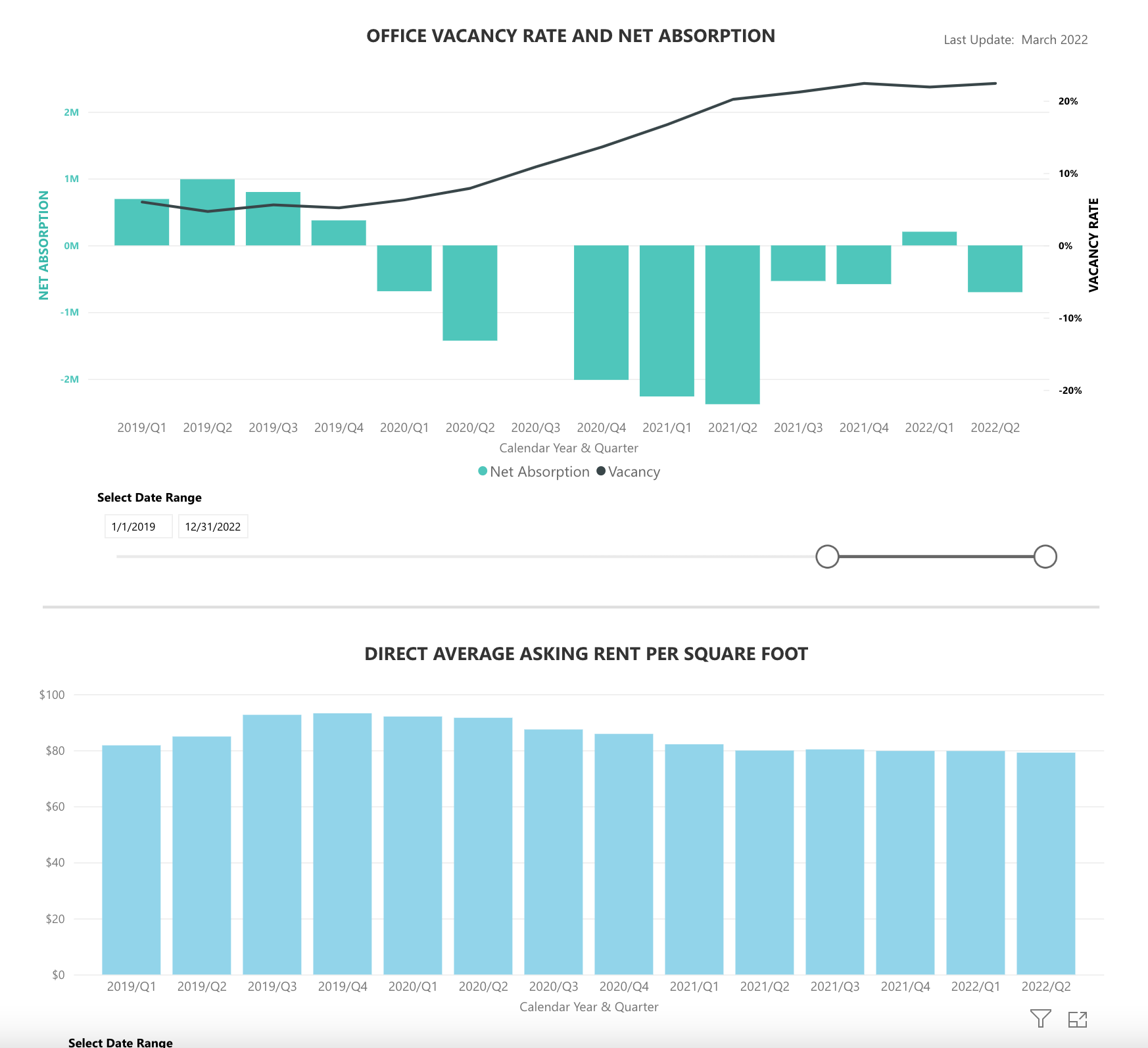
Worried about downtown’s rebound? You should be. A quick look at the economy scorecard confirms the commercial real estate sector’s woes: Vacancy rates are four times what they were in early 2019 but price-per-square-foot has only dropped 15%.
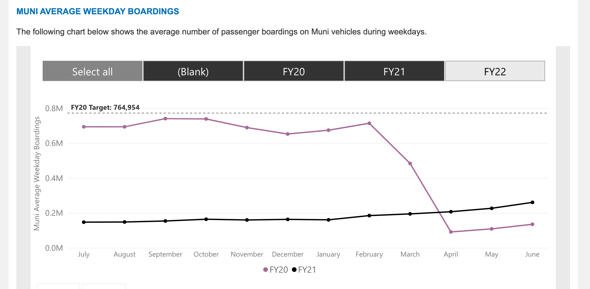
Think the bus is getting a bit more crowded? Right there too! The transportation scoreboard details a variety of public transport metrics, including weekday ridership for Muni, which is increasing slightly every month since collapsing during the pandemic.
Unfortunately, details about key areas are missing from the dashboard. If you want data on monkeypox or Covid cases, you won’t find them in the public health scorecard. And if you want more data about the homeless population, the scorecard leans on the point-in-time count, which is unfortunately only performed every two years.
“The scorecards are really more about measuring the city’s longer-term performance levels versus a target,” says Natasha Mihal, Director of City Performance in the Controller’s Office. She added that the scorecard team helped create the Covid visualizations on the Department of Public Health’s site.
The team also broke out homelessness on its own scorecard for the relaunch after working with the Department of Homelessness and Supportive Housing to determine the best metrics for gauging progress.
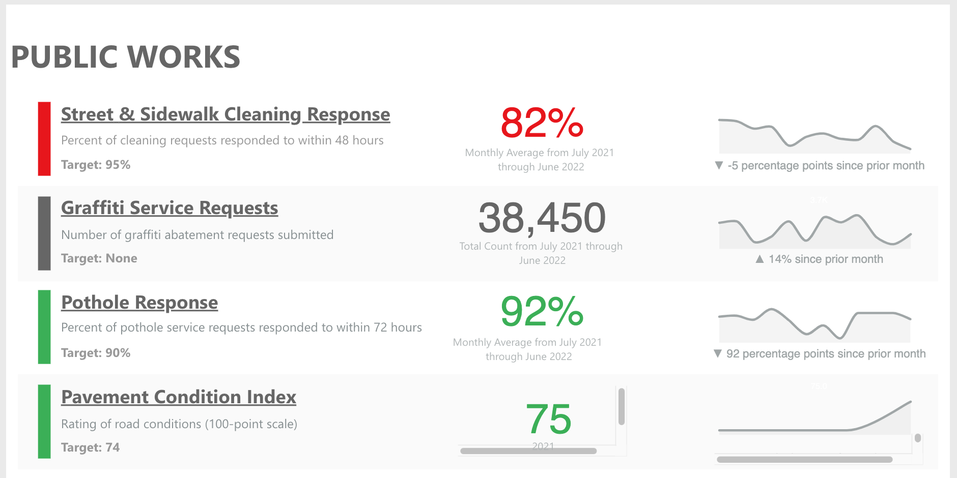
For many measures, the city’s performance is mixed. For example, the liveability scorecard shows street cleaning is missing the mark with only 82% of requests resolved in 48 hours.
The good news? Fully 92% of potholes are filled within 72 hours.